
2026 Home Color Trends: Warmth, Calm and Earthy Tones Set to Dominate
Every few years, a fresh wave of colors subtly infiltrates our living spaces, beginning on digital mood boards and social media feeds before manifesting on walls, furniture, and soft furnishings. For the upcoming year 2026, this wave is exceptionally rich and diverse, featuring the warm radiance of persimmon, the serene tranquility of cool blue, and the earthy profundity of jade.
Digital mood boards have evolved into one of the most influential forces shaping interior design choices, mirroring broader societal sentiments about our desired lifestyles. A recent 2026 report from the design research publication Alma de Luce emphasizes, "Color decisions will reflect behavior, culture, and a new relationship with time and space." This insight confirms that the 2026 color trends are deeply rooted in how people genuinely feel and aspire to live, extending beyond mere aesthetics to embody warmth, grounding, and emotional intention.
Interior Expert Unveils 5 Color Palettes Poised to Lead in 2026
Continue reading as we delve into the color trends that will define 2026 and provide practical guidance on their effective application in home environments.

The 2026 Color Trends Homeowners Are Embracing
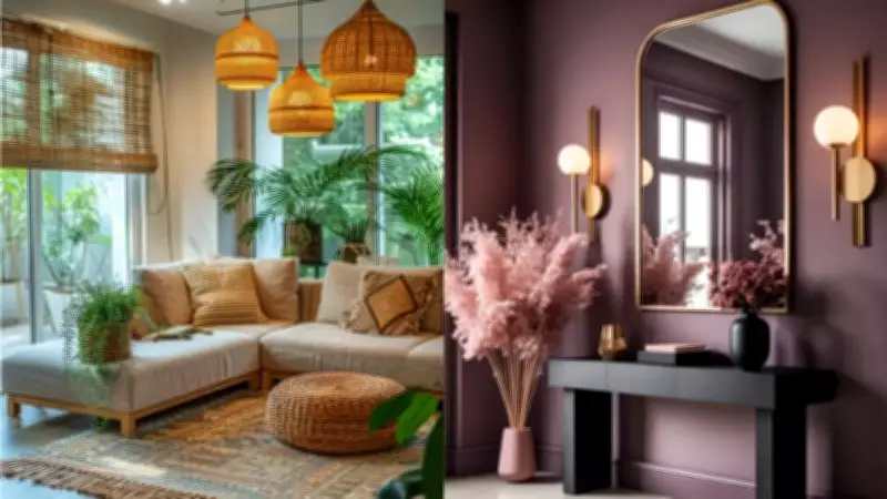
Pinterest's 2026 color forecast highlights five standout palettes, which experts interpret as a collective expression of our yearning for warmth, grounding, and subtle drama. A 2026 Bontempi design research report notes, "Earthy color palettes... create... a cozy and relaxing atmosphere." This reinforces the shift towards warm, nature-inspired hues such as persimmon, jade, and wasabi, which serve as tools for comfort and emotional regulation.
Persimmon: This burnt, golden-orange shade, reminiscent of autumn foliage and desert sunsets, instantly infuses a room with warmth. It is a color that energizes a space without being overpowering. In an interview with the Times of India, Geoff Brand, Founder of Bean Bags R Us, a premium Australian-owned brand offering stylish seating solutions globally, shared, "A statement chair, a throw, or a bold bean bag in persimmon can anchor a living room and impart genuine character."
Cool Blue: Soft, airy, and quietly sophisticated, cool blue leverages the well-documented psychological association between blue tones and calmness. "Cool blue performs best in spaces where you want the mind to slow down," said Geoff. "Bedrooms and reading nooks are the obvious fit."
Jade: Rich and grounding, jade bridges nature and luxury, offering the depth of a dark green without heaviness, and pairs seamlessly with timber, rattan, and linen. "Jade is one of those colors that ages incredibly well," Geoff noted. "If you're seeking a shade that will remain tasteful in five years, it's a sound choice."
Plum Noir: The most dramatic of the quintet, plum noir is a deep, blue-leaning purple exuding moody sophistication, ideal for evening spaces. "Plum noir doesn't necessitate dark walls from floor to ceiling," said Geoff. "Even a plum-toned rug or a cluster of cushions can transform a room's entire atmosphere."
Wasabi: Sharp, fresh, and slightly unexpected, wasabi is a yellow-green that injects energy without the intensity of lime. "Small doses of wasabi, like a vase, side table, or bean bag in a corner, allow the color to shine without dominating," Geoff explained. "It pairs particularly well with warm whites and natural wood tones."
Matching Color to Room Function
Selecting a beloved color is merely half the battle; its placement is equally crucial, as different rooms serve distinct purposes, and a shade that excels in one area may falter in another.
Here are interior design and home decor tips for aligning each palette with various rooms, considering mood, light, and function.
Bedrooms demand colors that promote rest. Cool blue and jade are excellent choices here, both evoking calm and natural associations that aid relaxation. Persimmon and wasabi, while appealing, may introduce excessive stimulation for a sleep-oriented space.

Kitchens and dining areas benefit from warmer, more sociable tones. Persimmon thrives in these settings, as does a muted wasabi on cabinetry or accessories; rooms centered on energy and connection are enhanced by colors that reflect those qualities.
Light is a frequently overlooked variable. North-facing rooms in the southern hemisphere receive less direct sunlight, making warmer tones ideal to counteract natural coolness. Conversely, rooms bathed in afternoon light can accommodate cooler palettes without feeling chilly.
"The most common mistake is choosing a color from a swatch while ignoring the room's behavior throughout the day," said Geoff. "Paint a large test patch and live with it for 48 hours before making a final decision."
Expert Warns Against Overstimulation and Advocates for Longevity
According to "Interior Colour Schemes for 2026 Trends," a Birla Opus design research article, "Color shapes how you experience your home... influencing how relaxed or focused a space feels." This strongly supports matching color to room function, explaining why cool blues suit bedrooms while warmer tones energize social spaces like kitchens.
Overstimulation is a genuine risk with bolder palettes, but the solution isn't always neutrality. One strong, well-placed color consistently outperforms three competing ones.
Geoff Brand concluded with advice: "Color trends move in cycles, and the 2026 palettes reflect a collective appetite for spaces that feel both grounded and considered. I encourage homeowners to prioritize longevity. The smartest approach is to anchor your room in a neutral base and layer trend-led color through updatable pieces like cushions, rugs, and seating. This way, when trends evolve, your space adapts seamlessly without the expense of starting over."