Have you ever settled into an airplane seat and felt an inexplicable sense of calm? The familiar hues, the subdued lighting, the sense of order—it's all by design, not accident. Aircraft interiors, especially on the thousands of Boeing planes flying globally, are meticulously crafted environments where every element, from seat fabric to ceiling tone, is chosen with passenger psychology in mind.
The Unseen Power of Colour in the Cabin
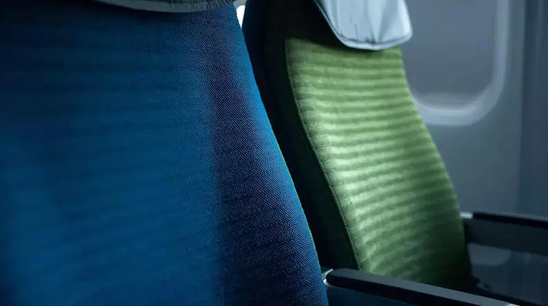
Walk onto any commercial flight, and you'll likely see a sea of blue seats. This is no random choice. While airlines frequently update their logos, blue remains a constant across cultures. Design experts, including those at Boeing, which supports over 14,000 aircraft worldwide, affirm that blue and green are universally linked to peace and calm. For nervous flyers, this subtle association can be crucial. Blue is scientifically shown to lower visual stress, making the enclosed cabin feel less oppressive once the doors shut.
There's a practical genius behind the choice, too. Blue hides marks, stains, and general wear far better than lighter shades like beige or grey. This helps maintain a clean appearance between deep-cleaning services, a vital factor for airline operations. Furthermore, shades like blue mixed with purple can subtly suggest quality and status without feeling heavy or imposing. The colour works quietly in the background, never demanding attention but always shaping the experience.

More Than Just Colour: Shaping Mood and Sensation
The application of colour psychology runs deep. Firms like the design studio Teague collaborate with airlines to select palettes for seats, walls, and trim that evoke specific moods. Research indicates cross-cultural emotional responses to colour: pink and lavender can convey warmth and care, while blue and green promote tranquillity. The depth of colour is equally critical. Lighter tones can create an illusion of a wider, taller cabin space, while overuse of dark shades can make it feel cramped.
Remarkably, colour can even influence physical perception. Virginia Tripp, a designer at Teague, points out that orange can make a space feel warmer, while blue or green can evoke a cooler sensation. Green might suggest moisture, and orange, dryness. Similarly, blue is often linked with clean, fresh scents, and pink with sweetness. These subtle cues collectively shape passenger comfort over long hours. Boeing has also introduced nature-inspired patterns on sidewalls to replicate the relaxed feeling of outdoor spaces.
The Critical Role of Lighting and Form
Lighting works hand-in-hand with colour as a silent yet powerful tool. On the Boeing 777, designers strategically placed lights to reflect off curved surfaces, softening shadows and making the cabin feel more spacious. Passengers reported feeling less boxed-in, a success that led to this lighting philosophy being adopted across other models. Today, dynamic ceiling lights simulate natural daylight cycles, brightening and dimming to suggest night and day, which can aid in reducing jet lag for passengers crossing time zones.
P.J. Wilcynski, a Boeing airplane interior manager, emphasises that modern design avoids hard lines and flat surfaces. Instead, the focus is on soft shapes and gentle transitions, prioritising a harmonious flow over bold contrasts. The ultimate goal for both colour and light is to go unnoticed. They succeed when the cabin simply feels right—calm, orderly, and intuitively comfortable—allowing passengers to relax from boarding to disembarkation.