
Bengaluru Civic Bodies Quietly Roll Out New Logos Designed by Students
The Greater Bengaluru Authority (GBA) and the city's five municipal corporations have initiated a significant rebranding effort by deploying new logos across their official digital platforms. This move, which began recently, marks a visual transformation for Bengaluru's civic administration without the fanfare of a formal launch event.
Logos Finalized in Executive Committee Meeting
The new logo designs were officially approved and finalized during an executive committee meeting held on March 20. The meeting was chaired by Deputy Chief Minister DK Shivakumar, underscoring the high-level governmental oversight of this branding initiative. Contrary to expectations of a public unveiling ceremony, the logos have been introduced discreetly, appearing directly on websites and social media channels.
Design Elements and Symbolism
The GBA logo adopts a circular format that prominently displays the authority's name in both Kannada and English. It retains a key historical element: the Kempegowda-era boundary tower, which was a feature of the former Bruhat Bengaluru Mahanagara Palike (BBMP) emblem. Additionally, the logo incorporates an image of Kempegowda himself, paying homage to the city's founder and emphasizing heritage.

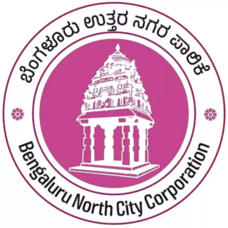
For the five corporations, the logos maintain the boundary tower as a unifying symbol but differentiate each entity through distinct color schemes and bilingual text. This approach ensures consistency while allowing individual corporations to express unique identities tailored to their specific roles and communities.
Student Creativity at the Forefront
Officials have revealed that the logo designs were crafted by students from Chitrakala Parishath, a renowned art institution in Bengaluru. A senior official elaborated on the creative process, stating, "As many as 58 draft logo designs were prepared, reflecting a blend of heritage and contemporary styles. The selected ones were chosen during the meeting." He further explained that while the boundary tower serves as a common thread, each corporation's logo has been customized with unique visual elements to enhance its distinctiveness.
Implications and Future Steps
This rebranding initiative represents a strategic effort to modernize the visual identity of Bengaluru's civic bodies while honoring historical roots. The use of student designs highlights a collaborative approach to public administration and fosters community engagement. As the logos become more visible, they are expected to reinforce brand recognition and streamline communication with residents. The quiet implementation suggests a focus on practical deployment over ceremonial gestures, aligning with efficient governance practices.