
The Rise of Strategic Color: Peek-a-Boo Paint Transforms Modern Interiors
Bold interior colors are making a powerful comeback, but this resurgence is marked by a smarter, more calculated approach. Instead of saturating entire walls with dramatic shades, contemporary homeowners are embracing a nuanced technique: placing vibrant hues in unexpected, partially concealed locations to craft intrigue and visual depth. This method, known as the "peek-a-boo" paint trend, is rapidly gaining momentum across social media platforms and interior design communities worldwide.
What Exactly Is the Peek-a-Boo Paint Trend?
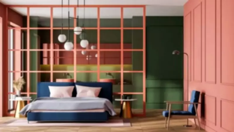
At its essence, peek-a-boo paint is defined by strategic restraint. Rather than committing to a full bold feature wall, this innovative technique involves introducing striking colors in areas that are only partially visible. Think the back of a bookcase, the interior of an alcove, a door frame, or the trim behind a radiator. The color reveals itself gradually, catching the eye from specific angles and infusing the space with a delightful sense of discovery.
A groundbreaking 2026 study published in the Journal of Environmental Psychology provides scientific backing for this concept. The research found that "targeted color placement within architectural elements significantly enhanced perceived depth and spatial layering without increasing visual overload." This directly validates the peek-a-boo approach, demonstrating how using color in specific, contained areas can make a room feel more layered and visually engaging without becoming overwhelming.

Why This Trend Is Capturing Hearts and Homes
Several factors have converged to make this the perfect moment for peek-a-boo paint to flourish. The rise of maximalism has encouraged homeowners to experiment with bolder colors, yet many remain cautious about fully committing. This trend offers an ideal middle ground—providing color confidence without the permanence of a full transformation. Additionally, with more individuals residing in rental properties, there is growing demand for home updates that are both easy to apply and simple to reverse.
Dr. Eleni Nicolaou, an Art Therapist and Creative Wellness Expert at Davincified, a US-based platform blending personalized art with creative wellness, explains the appeal: "Think of it as adding a surprise element to your interiors. The color is not shouting for attention but waiting to be noticed. That subtlety is what makes it feel so refined."
This sets peek-a-boo paint apart from traditional feature walls, which place bold color front and center. Instead, peek-a-boo paint collaborates with existing decor rather than competing with it, making it a versatile option suitable for a wide array of home styles and personal tastes.
Optimal Applications for Peek-a-Boo Paint in Your Home
Part of the trend's widespread appeal lies in its adaptability to numerous spaces within a home. Here are some of the most impactful areas to consider:
- Behind Shelves or Bookcases: Painting the wall behind open shelving in a contrasting shade instantly frames displayed items and adds remarkable depth to the entire unit.
- Inside Wardrobes or Cupboards: A bold interior color inside a wardrobe or kitchen cupboard remains completely hidden when closed, yet delivers a moment of delight each time the door is opened.
- Around Door Frames or Skirting Boards: Painting these architectural elements in a contrasting color draws thoughtful attention to a room's structure, feeling intentional rather than accidental.
- Stair Risers or Under-Stair Spaces: Stair risers represent an underutilized canvas. Applying a bold color here injects personality into a hallway without altering the walls.
Dr. Nicolaou emphasizes, "The areas that create the biggest impact are usually the ones people tend to overlook. A painted alcove takes maybe an hour but changes how the whole room reads."
Expert-Recommended Color Combinations and Common Pitfalls
To achieve the best results, consider these proven color pairings:

- White or off-white paired with emerald, navy, or terracotta for a clean, striking contrast.
- Tonal layering using different shades of the same color for a cohesive, sophisticated outcome.
- Warm neutrals combined with cooler accent shades like slate blue or dusty lilac for a quietly dynamic ambiance.
Dr. Nicolaou advises, "Look at what's already in the room and work with those elements. The accent color should feel like it belongs there, not like it was added as an afterthought."
However, to maximize this trend's potential, avoid these common mistakes:
- Overusing the Effect: If every alcove and door frame is painted in a contrasting shade, the impact diminishes. Select one or two spots per room and allow them to shine.
- Ignoring Lighting Conditions: Always test a paint sample in the actual location before committing, and evaluate it at different times of day.
- Using the Wrong Finish: Eggshell or satin finishes tend to be most versatile for this technique. A high-gloss finish in a living room accent spot can appear cheap rather than considered.
Dr. Nicolaou concludes with encouraging guidance: "If you're new to using color in your home, this is a great place to start. Painting the back of a bookcase or the inside of an alcove is low-stakes, costs very little, and can always be painted over—but the impact is often far greater than people expect. Start small, trust your instincts, and don't be afraid to experiment."
The peek-a-boo paint trend exemplifies how thoughtful, restrained use of color can transform interiors, creating spaces that feel layered, intentional, and uniquely personal without overwhelming the senses.